
Trackr App
Project Type: Product (UX/UI) Design
Year: 2024
Objective: Create an app and website for customers to track their budget and save towards big goals
OVERVIEW
MY ROLE:
UX Researcher & UI Designer
Conducted user research, competitive analysis, wireframing, and prototyping.
Designed and iterated the UI based on usability testing insights.
IMPLEMENTATION:
Figma
Primary User Research + User Interviews
User Experience
User Interface Design
User journey mapping
Many young professionals struggle to track their savings and achieve financial goals due to complex budgeting tools. Trackr simplifies the process with an intuitive, goal-oriented interface.
PROBLEM STATEMENT
SOLUTION
A mobile budgeting app designed to help users visualize savings progress, learn about financial management, and stay motivated toward their goals
RESEARCH AND INSIGHTS
Understanding User Needs
To build an effective budgeting app, I conducted user interviews with young professionals and recent graduates. Key insights included:
Users felt existing budgeting apps were too complicated or not visually engaging.
Many struggled with tracking specific savings goals.
PAIN POINTS
A simple dashboard to track financial progress at a glance.
A learning hub to educate beginners on financial literacy.
Savings goal visualization to keep users motivated.
CONSIDERATIONS
Competitive Audit

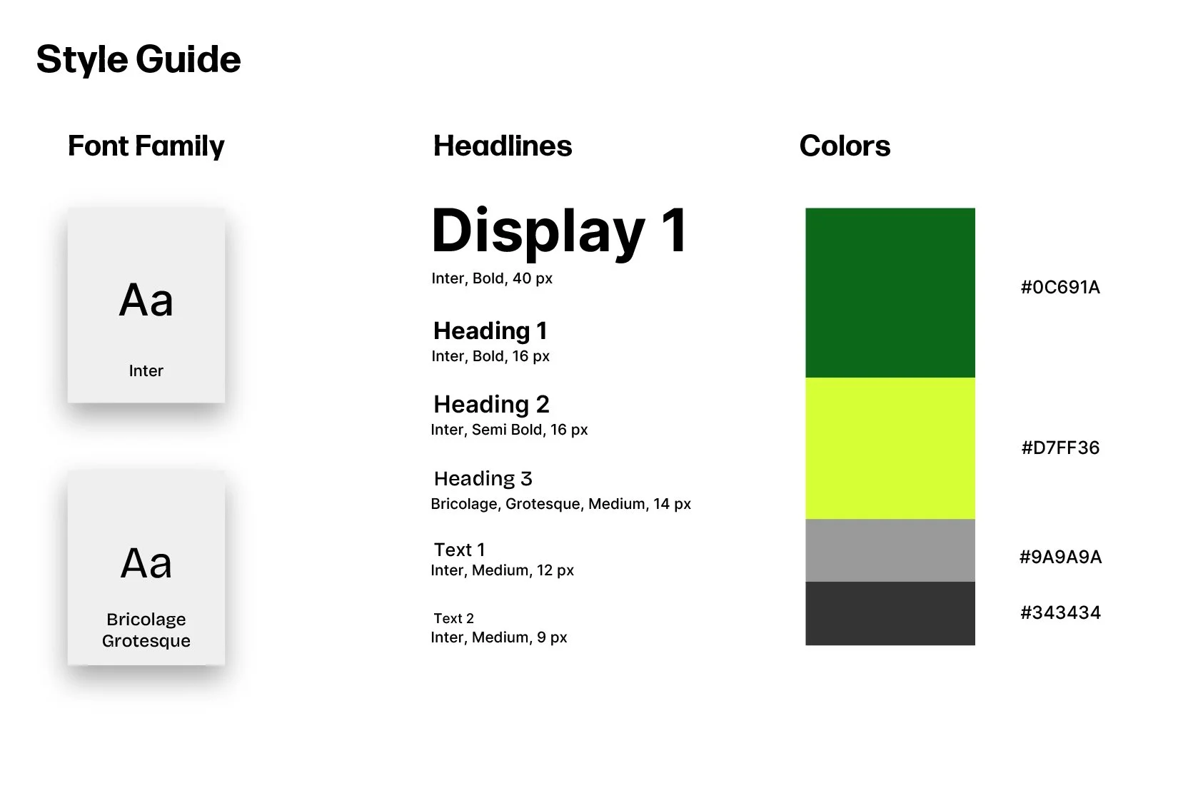
Style Guide
INVEST
Home Page
As the main overview for the app, I wanted to provide users with a snapshot of the most important information on a single page, including: how much money they saved, their linked banks, and general progress on their goals.
LEARN
Learn Page
For users that were new to investing, this page provides a resource guide in an easy-to-understand format.
There are guides to suggest to users to learn how to save their money efficiently and effectively.
TRACK
Track Page
For users to get a detailed look into how much they’ve saved across various goals and a trend report of their previous investments into their goals.
DESIGN PROCESS
1. Wireframing & User Flows
Before diving into UI design, I sketched wireframes and created a user flow to ensure seamless navigation.
Wireframes / Storyboards
Big Picture and Close-up storyboards provided a storyline for the average user of the app and what they were feeling, showcasing an emotional approach.
4 iterations of wireframes where I ultimately went with a mix between wireframe “A” and wireframe “D” as I felt they highlighted important features such as account balance overview and useful tips for new users
User Persona
User Flow
Using Figma, I designed an interface with:
A Home Page displaying total savings and tips.
A Goals Page with an overview of the user’s selectable goals.
A Deposit Page with keypad and display of how much would be deposited.
2. Low-fidelity UI Design
After the first prototype, I conducted usability tests, which led to the following improvements:
Simplified navigation for faster access and separation between investing, tracking, and tips.
More visual elements (progress bars, graphs) to make tracking goals engaging.
Personalized for spending habits.
3. Usability Testing & Iteration
Usability Study Research Plan
Overview of the research plan used to guide the usability studies featuring follow-up questions, project background, and goals I hoped to achieve.
Usability Studies
These were the results from the usability studies I conducted. Each participant tested the lo-fi prototype created and notes were taken on participants’ behaviors, which featured user feedback and overall thoughts on user flow.
Participant 1
Participant 2
Participant 3
Participant 4
Lo-fi Prototype Feedback
After testing, I categorized concerns and comments provided from the first iteration of the app’s prototype into similar topics that participants had reoccurring issues and concerns with.
From this study, the most prominent issue seemed to be the sequence of moving between screens and the confusion of how to fund and organize goals within the app.
KEY TAKEAWAYS
FINAL DESIGN FEATURES:
Designed a clean and minimalist UI with easy-to-read financial insights.
Gamified how users can set their goals with tracking to keep users engaged.
Created a learning section for financial literacy, especially for users new to investing.
LESSONS LEARNED:
User research helped refine the app’s purpose, ensuring it met real financial pain points.
Iterative testing showed the importance of visual clarity in budgeting tools.
Designing for motivation and engagement is just as important as functionality.
In the future, I would like to expand this app into website functionality and include more in-depth details of how users can stay motivated to keep up with their savings and make it a habit to invest. I would also like to explore how users can get the most of their money through the learning page, rather than it being an optional feature.